Рецепта · сайт
East Accelerator · Корицата на общността
Тенденции: Редакционно оформление (като списание) + Разчупена мрежа, органични композиции + Ръчна илюстрация и смесени техники. Концепция на Better Mechanics по рецептата — не е официалният сайт на марката.
Доказателството
WEB · EASTACCEL-SPISANIEREV 0.1
- axe serious
- 0
- overflow 360
- 0 px
- weight
- 180 KB
- h1
- 1
- lang
- bg
- date
- 2026-10-19
провереноaxe (WCAG 2.2 AA) в светла и тъмна тема · 360 px · автоматично; ръчният преглед предстои
(а) Многократният промпт (EN, неутрален към марката)
ROLE
You are a senior editorial web designer. Build ONE self-contained homepage concept for a
community organisation (NGO, foundation, cluster, network) as if it were the COVER and
first spreads of a community magazine.

TRENDS
1. Editorial layout (magazine): nameplate, cover lines, kickers, dek, drop cap, pull
   quote, numbered figure captions ("Fig. 1."), hairline rules, readable 60–75ch measure.
2. Broken grid / organic composition: 12-column grid with controlled overlaps, offsets
   and slight rotations (≤2.5°). Visual order may shift; HTML source order never does.
   At < 960px every overlap is removed and the page becomes one calm column.
3. (optional) Hand-drawn accents: 3–5 SVG strokes in one consistent line style
   (a scribbled ellipse around one key word, a double underline under another,
   one arrow, list dashes). They draw themselves once when scrolled into view.

THE IDEA
The mission sentence IS the cover headline (h1). Next to it, an SVG "network of people":
~40 dots start scattered and alone, glide into 3–5 organic clusters (communities), then
hand-wobbly edges draw in; finally accent-coloured "bridges" link the clusters
(people who support each other and do business together). One accent dot stays
outside: the reader. A button in the figure caption connects it to the network
(toggle, aria-pressed). Pointer near a dot highlights it and its edges; dots lean
gently toward the pointer.

LAYOUT (desktop ≥ 960px)
+----------------------------------------------------------------+
| Wordmark                                   nav: 4 anchors      |
|----------------------------------------------------------------|
| KICKER          REGION · ONLINE                  PRINCIPLE     |
| NAMEPLATE LINE 1 (serif 800, huge)                             |
|        NAMEPLATE LINE 2 (same serif, weight 250, muted)        |
| ===================== brand gradient ribbon ================== |
| H1 mission (serif, 8 cols)   [ SVG network fig, cols 6-12,    |
|  with scribbled circle +       rows 1-3, overlaps h1 edge ]    |
|  underline                                                     |
| cover lines (3) ↗ arrow                                        |
|        (rotating slogan seal)   Fig.1 caption  [Connect dot]   |
|----------------------------------------------------------------|
| LIGHT "PAPER" SPREAD: kicker rule · H2 · dek                   |
|  01 (huge light numeral)            sidebar: Who / Where       |
|  Programme A          02  Programme B (offset down)            |
|  drop-cap article (≤66ch)                                      |
|  "Slogan" pull quote, rotated -2°, hand underline              |
|----------------------------------------------------------------|
| DARK SPREAD: H2 + dek · role list (buttons) | role map SVG     |
|  (5 nodes, all-to-all edges; select = highlight)  Fig.2        |
|  "What we write about": 6 tiles, staggered, tilted ±1.5°       |
|----------------------------------------------------------------|
| EDITOR'S NOTE: brand voice as 4 giant stacked words, indented  |
|  differently · list "What you will not find here"              |
|----------------------------------------------------------------|
| BACK COVER (accent colour): H2 invite · button to real site ·  |
|  channels · hashtags                                           |
| Colophon: logo on white plate · legal name · concept label     |
+----------------------------------------------------------------+
Mobile: wordmark, nav wraps, nameplate, h1, figure, caption+button, cover lines, seal,
then each spread as one column. No overlap, no rotation.

MUST
- Only real content from the brand files. If a section has no source, drop it.
  No invented people, partners, numbers, results, testimonials, prices, awards.
- lang set to the content language; one h1; semantic sections with aria-labelledby;
  figures with figcaption; decorative SVG aria-hidden; data SVG role="img" + label.
- Self-hosted variable fonts with the correct local forms (e.g. Bulgarian locl).
  One serif for display (opsz axis if present), one sans for text. No mono needed.
- Brand colour tokens as CSS custom properties; derive darker text variants only
  when needed for AA contrast on light sections, and say so in a comment.
- WCAG 2.2 AA contrast, visible :focus-visible on every control, button states
  (hover lift with hard offset shadow, active press, pressed state).
- prefers-reduced-motion: final network state shown immediately, no drift, no seal
  rotation, strokes shown drawn; interaction (highlight, connect) still works.
- rAF loop pauses when the figure is off-screen or the tab is hidden.
- No horizontal scroll at 360px; page < 1 MB without fonts; no external requests
  (no CDN, no Google Fonts, no stock photos). <link rel="icon" href="data:,">.
- Footer label: "Concept by <studio> from a recipe · not the official site of <brand>".

FORBIDDEN
- Centered hero + three cards; purple gradients; glassmorphism; generic 3D blobs;
  AI "people" photos; text over faces; justified text; -webkit-text-stroke on
  variable fonts (overlapping contours show through); overlaps on mobile;
  promises the organisation does not make (funding, results).

TECH
Single index.html, inline CSS + vanilla JS (~200 lines), SVG drawn in code with a
seeded PRNG (deterministic layout), quadratic-curve edges with a fixed per-edge
jitter for the hand-drawn feel, stroke draw-in via pathLength="1" + dashoffset.
(б) Брифът за тази марка
- Марка: Фондация „Източен Акселератор“ / East Accelerator. НПО, без цени.
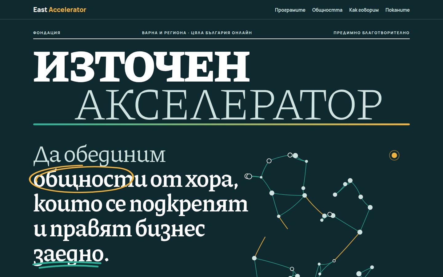
- h1 (мисията, дословно): „Да обединим общности от хора, които се подкрепят и правят бизнес заедно.“ — „общности“ е оградена с жълт ръчен кръг, „заедно“ е подчертана със зелена двойна линия.
- Заглавната лента: „Източен / Акселератор“ (Piazzolla 800 и 250).
- Кориците редове: програмите (преакселераторска и акселераторска, под собственото име) · за кого · „Предимно благотворително.“
- Печатът: слоганът „Create your future!“ (остава на английски, както е в марката;
lang="en"). - Водещата тема (светла „хартия“): „Две програми. Едно име.“ — 01 Преакселераторска програма, 02 Акселераторска програма; страничната колона „За кого“ (петте групи от бранд кита) и „Къде“ (Варна и региона; цяла България онлайн). За съдържанието на програмите няма данни, затова описание няма. Текстът казва само, че подробностите са в поканите.
- Общността: петте роли като карта „всяка с всяка“ (Фиг. 2); „За какво пишем“ — шестте теми от бранд кита.
- Бележка на редакцията: гласът „Прямо · Топло · Доказано · Без апологии“ и списък „Какво няма да намерите тук“ (от забраните: измислени числа, обещания за финансиране, истории без съгласие, чужди програми). Програмата BASE не се назовава.
- Задна корица: покана към eastaccelerator.com; каналите LinkedIn и Facebook (без адреси, защото ги няма в бранд проекта); хаштаговете.
- Цветове (tokens.json): фон
#0F2A2E, втори фон#123B40, текст#FFFFFF, второстепенен#CFE3E0(той е и фонът на „хартията“), акцент#F2B33D, втори акцент#2BB39A, текст на бутон#0F2A2E, лентаlinear-gradient(90deg,#2BB39A,#F2B33D). Производен цвят:#176A5B(тъменakcent2, за текст върху хартията; 4,8:1). - Шрифтове: Piazzolla (заглавия, opsz 30) + Manrope (текст, етикети) от
../_obshto/fonts/. JetBrains Mono от бранд кита не се ползва (забранен в галерията); етикетите са Manrope 800 с разредка. - Радиуси: 2 px, 14 px и 50 px (хапчета) от tokens.json.
- Тема: само тъмна (марката има една тема).